Steam’s popular gaming client is constantly under development, not least since the Steam Deck was introduced. Today, Valve presents a major facelift for desktop-version, where things happen both with design and under the hood.
The biggest and most noticeable is that Valve is redesigning its “game overlay”, the semi-transparent menu that can be picked up from within games. There, Valve is building a completely new user interface that, in addition to previous functions, such as chat and friend list, includes several new tools.
A new view with more details about the running game.
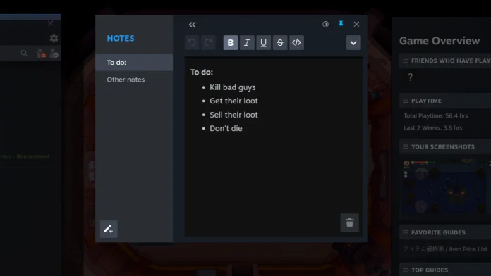
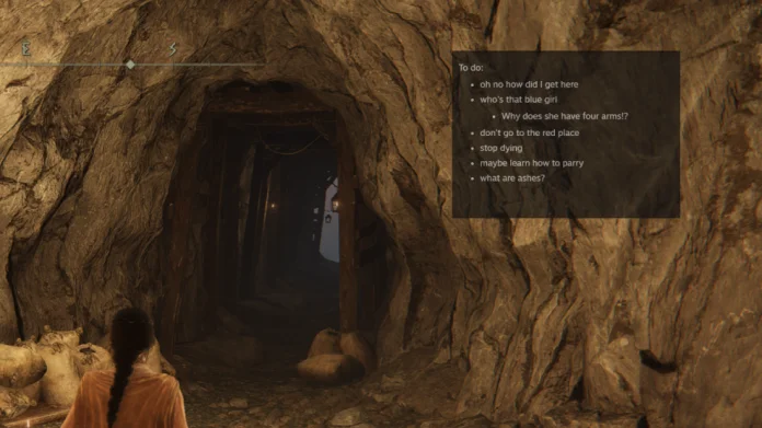
The interface includes, among other things, a completely new, significantly more detailed game overview. It includes, among other things, news for the game, which friends are playing the same game, guides and achievements. For those who want to make their own lists, a small “notepad” is introduced, from which notes can be attached to the screen, which are also visible during gameplay. In the same way, it should also be possible to attach other windows, for example to show a guide or a video clip.
On top of that, notifications and the screenshot tool get a boost. Because the former is adjusted when the green light indicating a news actually lights up and the field is limited to new notifications. The screenshot tool is expanded with the ability to handle both local images and cloud-saved variants, sorting by game and the ability to select thumbnails.
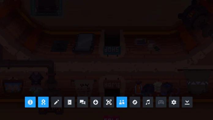
Last but not least, the whole thing is supplemented with a new toolbar at the bottom. In short, it should make it easier to find and navigate among all the new functions. Currently, Steam’s client beta is required to take part in the updates, which have not been rolled out yet. It is free and the easiest to activate through the settings in the Steam client.
What do you think of the changes? Is it something you get to use?
2023-04-28 14:59:22
#Steam #major #facelift #menus #tools


