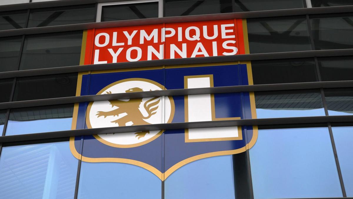
In Lyon, the revolution continues. After the arrival of John Textor as majority investor and the ambitious recruitment which has already started well, Olympique Lyonnais unveiled a modernized logo this Friday. Similar to its predecessor, the latter however displays a more refined design, thinner golden contours and removed from the letters “O” and “L”.
–
While the club has seen fit not to communicate about this change more “compatible with new uses such as digital”, the latter still angered some supporters on social networks. Indeed, among them, some have noted that the traditional Lyon red color now seems to be approaching a lighter shade, similar to pink. A fire quickly extinguished by the club which wanted to reassure its loyal supporters, specifying that this impression was due only to a simple “screen problem”. At the dawn of the 2022/23 season, all the lights seem to be green for the Rhone club.
L’@OL change their logo! 🔴🔵
What do you think ? pic.twitter.com/P76xmApEYt
— Prime Video Sport France (@PVSportFR) July 1, 2022
–
–


