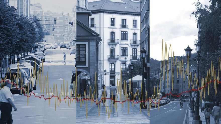
“The main pattern of mortality risk in the diseases analyzed is the socioeconomic level,” explains Ana Fernández Somoano
In this sense, they are more likely to die in neighborhoods such as Teatinos or Ventanielles in Oviedo or the western area of Gijón. In the study itself, maps related to each disease are collected. In the graphs collected in this information, an average has been made that offers a general photo of the risk of dying once a disease has been diagnosed. In areas with inequalities, for example, you are more likely to have diabetes due, among other things, to a lack of education or poor diet. Low wages, unemployment, poor access to medication or sports, and increased tobacco or alcohol abuse lead to poorer health. And that leads to higher mortality.
Let’s look at practical examples: in the rural area of Gijón the probabilities of dying with AIDS or dementia skyrocket. Two diseases closely followed by others such as cirrhosis or COPD. In the western part of the council (traditionally more industrial and with the influence of the El Musel port), the probability of dying from lung cancer skyrockets.
If we go to Oviedo in Colloto, COPD also appears as a more than prominent disease in excess mortality, while in the area of Antiguo AIDS and stroke are triggered. In Avilés there is a clear problem with cirrhosis in the Llaranes area. A disease whose mortality soars even more in terms of excess mortality in the surroundings of the La Carriona cemetery.
Explanation of the graphics
The following interactive graphs show, practically street by street, the excess mortality for a given disease in each area studied. That is to say: if in a specific street the excess is 30 percent, it means that in recent years 30 percent more residents of the area died of that particular ailment than they should have, according to the average. The study has been divided between men and women in such a way that you can choose one of the two sexes and see how reality changes.
–
The studio doesn’t just collect a still photo. Researchers have analyzed a time trend between 1996 and 2015. Fernández Somoano acknowledges that despite the fact that in these two decades health care has greatly improved and good educational practices related to health have spread, the differences still exist. In what there are no differences is in the different territories of Spain: in all of them this correlation has been observed between lower economic income and a higher risk of dying when suffering from a disease.
In Asturias, the data from the Mortality Registry of the Ministry of Health and the SADEI have been crossed. To understand the data, it must be taken into account that they are weighted. That is, a value of 0 for excess risk indicates that in the area studied there have been as many deaths from a disease as those expected by statistics. A value greater than 0 for excess risk indicates that more deaths have been observed than would be expected in that particular neighborhood. Deaths that, in this case and in the light of the results, occur especially in more economically depressed neighborhoods.
The project to elaborate a National Atlas of Mortality emerged in 2004. At that time only seven autonomous communities collaborated in the project. Just a few months later, in 2008, a new version was released in which data from Asturias were already incorporated with the help of researcher Valentín Rodríguez. In this latest version it has been working since 2016.
– .

