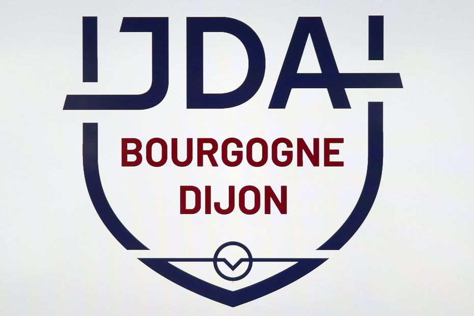
Announced yesterday with great fanfare on social networks, the new JDA Dijon logo does not seem to convince all supporters. On the side of the basketball and handball club, it is explained that it is only a matter of time for the disgruntled fans to adapt to this change.
La marseillaise à pétanque 2022, 61st edition of the world –
New season and new visual identity for the JDA Dijon. The club proudly unveiled its new logo this Wednesday, June 29 on its social networks.
A graph “resolutely modern and dynamic”, as presented by Thierry Degorce, president of the JDA group, composed, of course, of the club’s coat of arms, an owl with outstretched wings in reference to Dijon and a ball, symbol of the basketball and handball sections of the institution . All against a blue and wine-colored background, echoing both the club’s history and Burgundy.
“The old logo dated back to 2008, 14 years, that’s a long time. The visual identity is now more in line with reality. The logo represents the new sporting cycle that started a year ago. We are changing dimension, we grows. But we do not want to free ourselves from our 142 years of history. We want to put down roots, to remain solidly on our territory”explains Lucie Bongiovanni, sales and marketing director of the JDA group.
In total, the new graphic required three years of reflection and one year of project. The logo was developed by Sevanova, an entity that belongs to the JDA group. But despite these years of work, and a cleverly distilled announcement on social networks, the new crest does not seem to satisfy the supporters.
A bit bitter, Saïd wonders if it’s not “the intern who did it”. Overall, JDA devotees find this logo lacking in whimsy and color. Jay finds it for example “sad and not suitable”. Bruno himself considers that he is not “not crazy crazy as the young people say”. Not sure that young people really use this expression, but we get the idea!
And then even France Télévisions has the right to its little tackle since Ludovic wonders if the JDA logo has not been “created by the same agency that made the Fort Boyard tigers”. It hurts us.
On the side of the JDA, it is explained that the supporters who appreciate the logo do not necessarily express it on social networks. A silent majority in short. As for unconvinced fans, it’s only a matter of time.
“It obviously touches us to see certain returns that we did not imagine. But we know that people are attached to the old logo with which there were very good sporting adventures. The supporters love the club. is a logo that means a lot, which is linked to the history of the club, it will take a little time for some, but we hope for a good sporting season so that they appreciate it”details Lucie Bongiovanni.
Last year, the JDA basket went to the semi-finals of the championship play-offs. It will therefore be necessary to do as well so that the new logo wins the hearts of the supporters.
–

