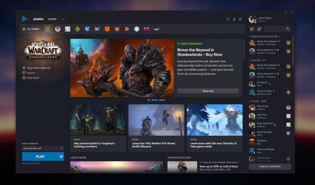
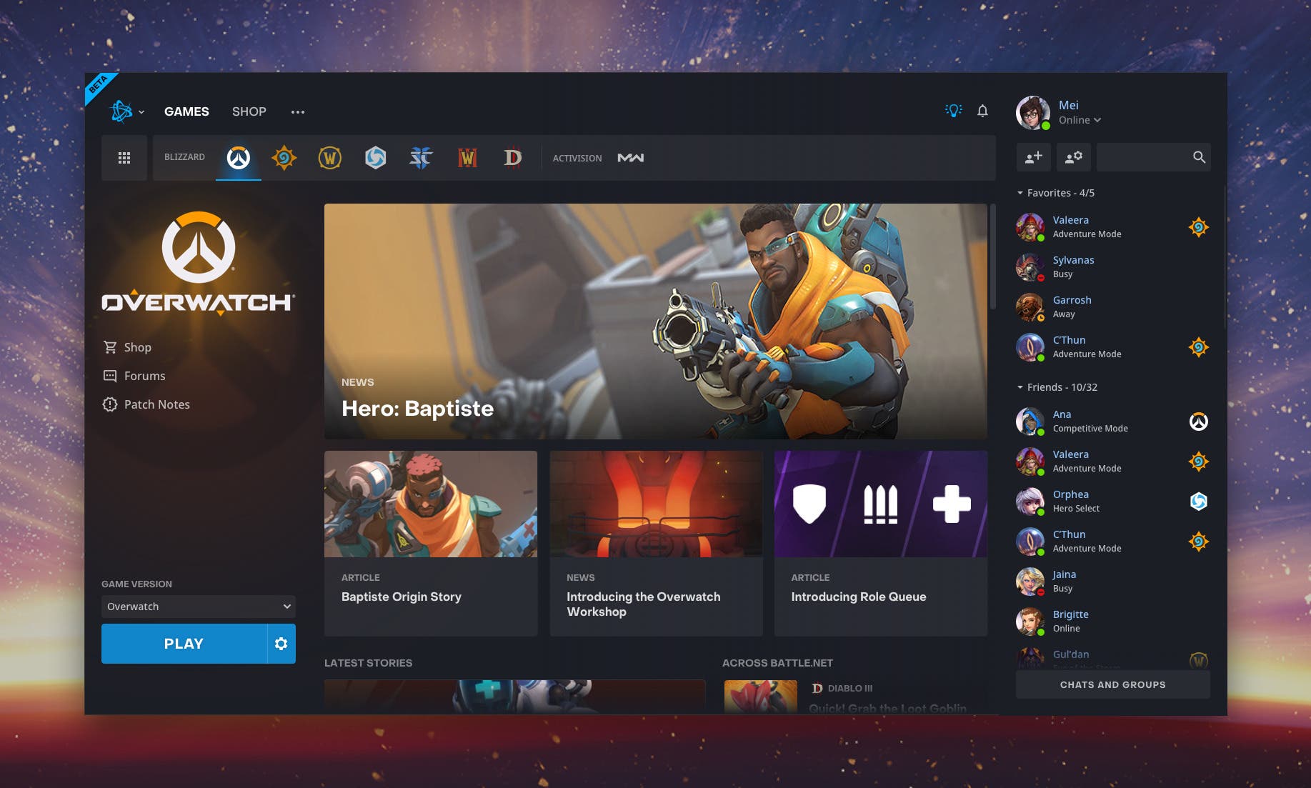
Blizzard and Activision have prepared a complete restructuring of the aesthetics and functionality of their video game platform
Recently, Blizzard and Activision have executed the previously made decision to modify the interface of Battle.net, which has finally completed its beta period. According to what is explained in its respective entry, it is the most important update in recent years in the life of the platform, which has been accompanied by the following message: “We are very proud of all that you have done to help people connect and play Blizzard games together quickly and easily. With the new version of the application, we want to welcome players of all skill levels and ensure they are fluent in the app“.

On the other hand, as regards the most outstanding modifications, the team has shared the following synthesis:
- Navigation and design improvements: now you can mark your games as favorites and organize them to access them more easily.
- A much larger layout to host news and games in a full page view.
- A renewed social panel so that you can better see your friends and their activities in the tab of each game.
- Major accessibility improvements: almost the entire application can now be navigated with the keyboard, we’ve increased screen reader support, and improved color contrast.
- A new unified notification center for messages and download statuses.
However, it is imperative to emphasize that this update of Battle.net, at the moment, it is only valid for North America. “Other regions will follow in the coming weeks“, adds the note, where they also state that they will continue”working, getting better and adding features to the app in the near future“although without specifying a specific day for the arrival of this version 2.0 of the service.
–


