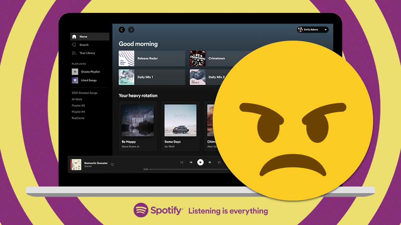
Last Thursday, Spotify announced the arrival of a new design for its Web and desktop application (Mac and PC). The idea is to unify both experiences and – according to the company – make them easier to occupy. Well, there are people who disagree.
If you still do not receive the new desktop App on your PC or Mac from Spotify, do not worry, it will arrive soon in the updates. Similarly, you can see it running in its Web version (open.spotify.com), since everyone can experiment with it there.
The company says the intent of this redesign is “Combine the technical opportunity of a modern, scalable web player, along with a consistent Spotify design and the features everyone expects in the desktop application.”
Not everyone is happy
The first complaint that has been felt by social networks and company forums it was removing the search bar at the top, to locate it as a button on the left side menu. Now, this essential action within Spotify, has to be done with a ‘click’ plus.
Another repeated claim is the new artist pages. There is no longer a display of songs by album and there are only the album covers. To see the songs they contain, you must do click in each production to be deployed. This will take you to another page, abstracting you from other works by the artist. Namely, everything leads to constants clicks to go back and forth when you are discovering an artist from your page.
Something unforgivable. The Web version it won’t let you order the songs of some list by dates, for example, starting from the most recent added. Neither by duration of the song or name of the artist. It only shows them from the first track added (historical), hereinafter.

And finally (because there are many other more specific comments), users claim for the purge of the accesses related to the personal library of each one. Delete the links, from the left sidebar, to sections like: «Podcast», «Artists» “Recently played” and more, has several uncomfortable.

The bad news is that this new design has no turning back. At least Spotify has been a participant in the complaints -on social networks- and responds to those who have presented their concerns. And we hope that in future updates, Rather than imposing ‘experiences’, be friendly with making them to the consumer’s taste.
–

