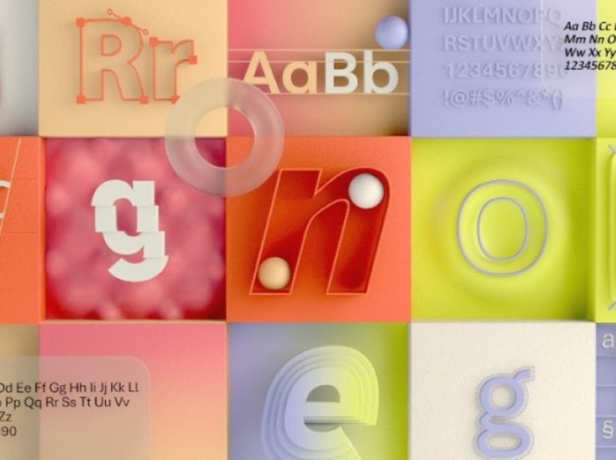
Microsoft is looking for its new default font and encourages users to decide what it will be.
The company’s default font in all Microsoft products has been Calibri, which replaced Times New Roman in 2007.
There are now five new candidates for the default font: Tenorite, Bierstadt, Skeena, Seaford, and Grandview.
“The degree to which seemingly minute differences in typography can create visceral responses,” says Microsoft, is apparently “a testament to the art and science of font design.”
The various fonts described “span the various sans-serif styles: humanistic, geometric, Swiss, and industrial,” Microsoft adds.
Erin McLaughlin and Wei Huang’s Tenorite “has the overall look of a traditional sans serif workhorse,” and is round, wide and sharp, according to the designers. Its perfect fit apparently allows more words to fit on one line, but has “generous space between characters.”
Steve Matteson’s Bierstadt is inspired by mid-20th century Swiss typeface. It has large block-shaped letters with small embellishments or contrast between thick and thin lines.
“Microsoft already has Arial, which has a lot of grotesque type attributes that predate Helvetica, and my approach was to design a sans serif that contrasts with Arial by being much more mechanical and streamlined,” says Matteson.
“The terminal ends are precisely cut to 90 degrees, a modern note that contrasts with the smoother angled ends in Arial, and a lack of the somewhat fussy curves found in the ‘a’, ‘f’, ‘ y ‘and’ r ‘for Arial “.
Skeena, by John Hudson and Paul Hanslow, is a “humanistic” sans serif font with modulated strokes and a striking contrast between thick and thin lines, apparently making it ideal for body text in long documents. That contrast is generally associated with luxury brands, which work in large print but can be “unsightly and … flimsy” if too small.
Read more: Ditching coal power would counter climate change: the head of the International Energy Agency
Seaford, by Tobias Frere-Jones, Nina Stössinger and Fred Shallcrass, is “gently organic and asymmetrical”, but it should be useful for shapes, as the differences between the letters should make recognizable words.
“To signal the kind of familiarity and ‘comfort’ the typeface should evoke, we also looked at images of old armchairs … nothing overtly luxurious or nostalgic,” says Stössinger.
“When it comes to italics, it turns out that there are parallels between the ergonomics of the chair and the typography: instead of puffing it up and making it softer, rely on the stiff moments that are good for your back.”
The last entry is Grandview, by Aaron Bell. Derived from classic German road and rail marking, and made to be readable from a distance and in adverse weather conditions, Bell enlarged the font while maintaining the same height. This made it more readable for body text, where it was not used often.
All five sources are currently available for use, and Microsoft will use polls and “social media feedback and comments” as to which one to choose. Once a decision is made, it will become the new default font in 2022.
–


