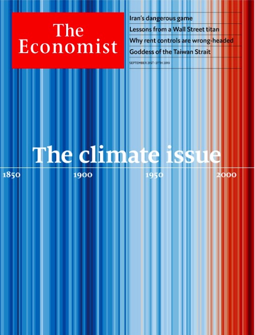
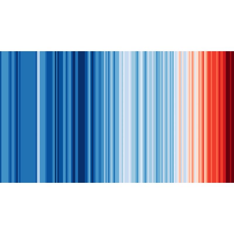
Imagined in 2018 by the British climatologist Ed Hawkins, from the University of Reading, these are simply the average temperatures of the Earth from 1850 to today compared to the average temperature of the 20th century. Each vertical line represents a year: the further to the right, the more we progress towards the end of the 20th century, and the more clearly the warming trend is displayed. In fact, the darker the red, the greater the deviation from the 20th century average.
This is the same data that is used most often for one of those more classic graphs showing an ascending curve of average temperatures. But visually, stripes strike the imagination… and look great on a t-shirt. Thus, joining this week —On the occasion of the summer solstice— the virtual campaign #ShowYourStripes (literally: Show your stripes) several have even taken the opportunity to… display their colors.
But long before clothing, the transposition of temperatures into stripes had above all been designed for popularization: a way of illustrating a rise in temperatures which is not easy to apprehend, since it is part of a long duration which makes it hardly perceptible to humans – which explains the indifference, even the denial of the phenomenon among some.
Even the magazine The Economist made it its cover page in September 2019.

For those who want to display the average temperatures not of the globe, but of their country, the site Show Your Stripes allows for a little exploration, as data may be leaner in some areas. The World Meteorological Organization and the United Nations Climate Conference are among the groups that have supported the campaign this week.
–


