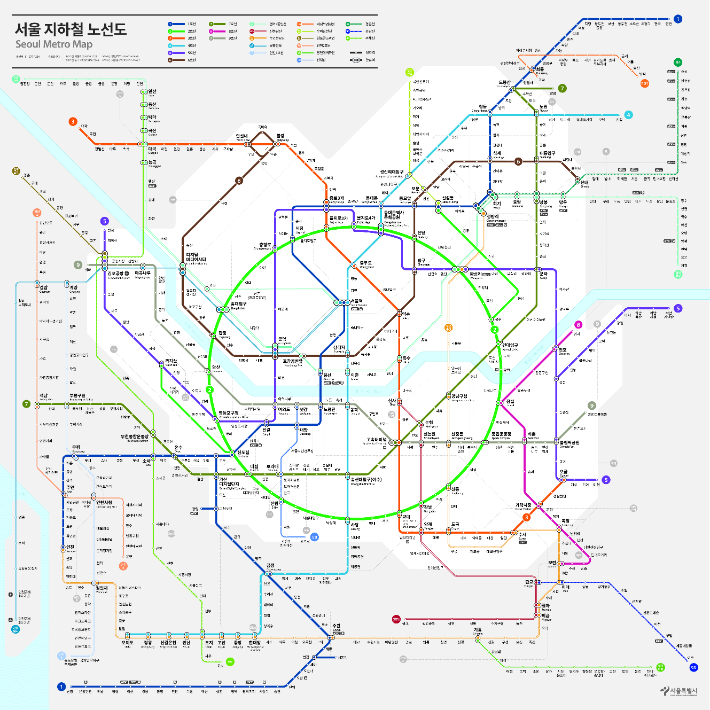
The Seoul subway map will be replaced for the first time in 40 years. Line 2, which was previously expressed as a square, was changed to a circular shape, and major geographic information, such as the Han River, was included in the route map to enable more efficient location identification.
The city of Seoul announced on the 13th that it will announce a new ‘Seoul subway map design’ that is easy for everyone to read after consultation with experts in fields such as vision, color, design, perception, and transportation. The improved route map will be unveiled at a public hearing held at Seoul City Hall on the 18th.
The current route map maintains the form of the 1980s, with only routes added. It has increased from 106 stations on 4 lines in the 1980s to 338 stations on 9 lines in the 2000s, and currently has 624 stations on 23 lines.
In addition, the city explained that if 10 new lines, including the Sillim Line, Dongbuk Line, Mokdong Line, Wirye Line, and the 4th stage extension of Line 9 and the GTX, are constructed in the future, it will be difficult to apply additional expansion routes to the existing route map.
In addition, it was pointed out that the existing route map has a multi-line form with various angles, making it difficult to know the location, general stations and transfer stations are not clearly distinguished, and there is a lack of consideration for users due to a lack of awareness of geographical locations such as airports, rivers, and the sea. .
Existing route map. Provided by Seoul Metropolitan Government
Accordingly, the improved route map uses an 8-line format that makes it easy to recognize many routes and transfer stations. 8-line is a route map concept applied to the London subway and is used as a standard for schematic maps that allow only diagonal and straight lines for easy recognition by users.
In addition, the Taegeuk-shaped transfer station sign was changed to a traffic light style to improve visibility, and geographic information such as the Han River, West Sea, and airport to improve understanding of locations was displayed. The Line 2 loop line was centered in a circle and geographical information was displayed to make the route easier to read, and colors and patterns were applied to make the routes easier to distinguish.
Another feature is that, considering foreigners, station numbers and routes are shown together on the route map, which previously only showed station numbers, to make it easier to find.
The city announced that the improved design was tested on domestic and foreigners in their 20s and 30s and that the time required to find a station was reduced by up to 55% and the time required to find directions to a transfer station was reduced by up to 69%. In particular, it is expected that this will be of great help to first-time visitors to Seoul, as the time it takes for foreigners to find their way has been reduced more than for domestic users.
2023-09-14 10:18:09
#Line #round.. #Subway #routes #changed #time #years


