Intan Rakhmayanti Dewi, CNBC Indonesia
Tech
Friday, 18/08/2023 19:40 WIB
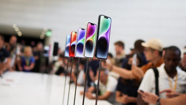
Photo: Guests see the new iPhone 14 at Apple’s event at their headquarters in Cupertino, California, United States, Wednesday (7/9/2022). (REUTERS/Carlos Barria)
Jakarta, CNBC Indonesia – Apple again moved the “end call” button to the center of the screen in the latest developer version of iOS 17, which was released last Tuesday.
A previous beta version of iOS 17 moved the red “end call” button to the bottom-right corner instead of the center at the bottom of the screen, which was used for years.
In the latest developer beta, the end call button is centered vertically, in the middle of the three buttons near the bottom of the screen.
Since it’s still in beta, it’s likely that Apple’s user interface changes aren’t final and only appear in Apple’s developer beta. Moreover, this change has caused a variety of protests among users who have tried it.
Apple’s developer and public beta release program is meant for software makers and early adopters to test the new iPhone operating system and find bugs before it’s officially released in the fall with the new iPhones.
In the latest beta, the call ID function was updated with a new feature called “contact poster”. This lets users choose which photos appear when they call other iPhone users.
Well, since the new photo takes up most of the screen during a phone call, so Apple moved the button down.
In summer 2021, Apple is considering a similar change to Safari that moves the URL bar to the bottom of the page, which is more ergonomic for most people on larger screens.
But Apple scrapped some of the planned changes and gave users the option to move the URL bar back to the top of the page before the official software release.
Apple has also moved where push notifications appear at the bottom of the iPhone screen in recent years.
Watch the video below:
Video: Cheap Chinese HP Compact Copy iPhone, Interested?
(fab/fab)
2023-08-18 12:40:00
#Apple #Flooded #Complaints #iPhone #Button #Overhauled

:focal(995x505:1005x495):watermark(cloudfront-eu-central-1.images.arcpublishing.com/ipmgroup/OIO44DUUUNC2DB5T3FIJECBT5U.png,0,-0,0,100)/cloudfront-eu-central-1.images.arcpublishing.com/ipmgroup/N3R4CWHGQ5E6ZEUERDGTXIRFIE.jpg)
