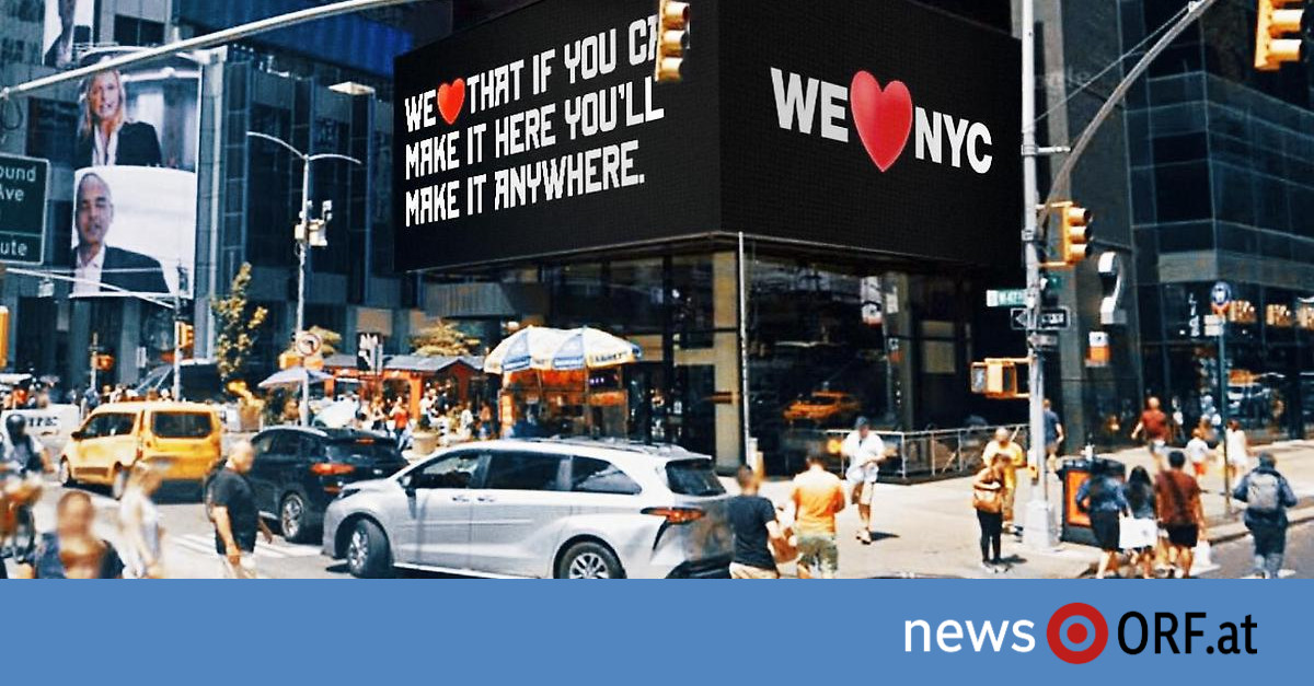
“We took the I from I love New York and replaced it with a we,” Mayor Eric Adams said at Monday’s presentation. The reasoning behind it: while “I love New York” has a very touristy connotation, the 20 million dollar campaign “We love New York City” is primarily aimed at the population of the 8.8 million metropolis and go hand in hand with an initiative for social commitment and neighborhood help.
Shortly after the presentation of the new logo, the social media surged, as several US media reported on Tuesday. “If there’s a riot in New York, it’s because of that,” it said on Twitter. Above all, the arrangement of the iconic heart causes confusion – “Is it now ‘We love New York City’ or rather ‘We love New York City’?”
Connection to the New York subway
The idea was to give the logo a modern twist, designer Graham Clifford told the New York Times. He adapted the font that is also used on the city’s subway signs. According to Clifford, the subway system is like the veins of the city, the beating heart of New York. “There are Wall Street guys sitting next to construction workers. It is a place where everyone comes together and we are aware of that.”
Clifford followed in big footsteps with his work. Incidentally invented by Milton Glaser in the 1970s, the now trademarked logo brings in over $30 million a year in royalties to the state of New York.
“You don’t play with perfection”
The remastered version of New York love will have to fight its way into the hearts of New Yorkers, a myriad of social media comments suggest: “Anyone involved in graphic design needs to despair,” “Perfection is a game to play with not”, “Milton Glaser would turn in his grave” and the like can be read. In addition to the font, the 3-D shading of the heart is particularly criticized – the new look would suit an investment bank or a company in the health sector better than a city.
The presentation of the new campaign also faltered in the details: the homepage Welovennyc.nyc was temporarily unavailable, the Twitter handle of the same name – which was linked many times on Monday and also by official accounts – is owned by a private individual and is currently closed.
Excitement priced in?
The campaign has already achieved one goal with all the excitement: attention in the city. Shortly after the presentation, Columbia University branding expert Matthew Quint told The New York Times that the logo would be discussed on social media. And Kathryn Wylde from the lobby organization Partnership for New York, which was in charge of the project, was pleased about the emerging debates.
However, behind the logo there is a whole range of initiatives – in cooperation with social institutions, environmental organizations and cultural institutions. The city weathered the darkest days of the pandemic through the selfless efforts of ordinary citizens. If everyone volunteered for just one hour a week, Adams said, it would make a difference. “The campaign calls on everyone who loves this city to lend a hand and spread the love to every block in all five boroughs.”
“We love NYC” should reflect the energy of the city and preserve the spirit of the city, said New York Governor Kathy Hochul at the presentation. New Yorkers of all backgrounds should be encouraged to “come together, get involved and change their community for the better”.
Declaration of love after 9/11
It’s not the first time the logo has been set to change. After the attacks on the World Trade Center in 2001, designer Glaser decided to update himself: “I love New York” became “I love New York – more than ever”, the red heart was given a black frayed edge on the lower left edge Spot. “That blow only made us stronger,” Glaser told the New York Daily News at the time. “It’s like when someone you love has a heart attack and survives. That’s when you realize you love him more than ever.”


