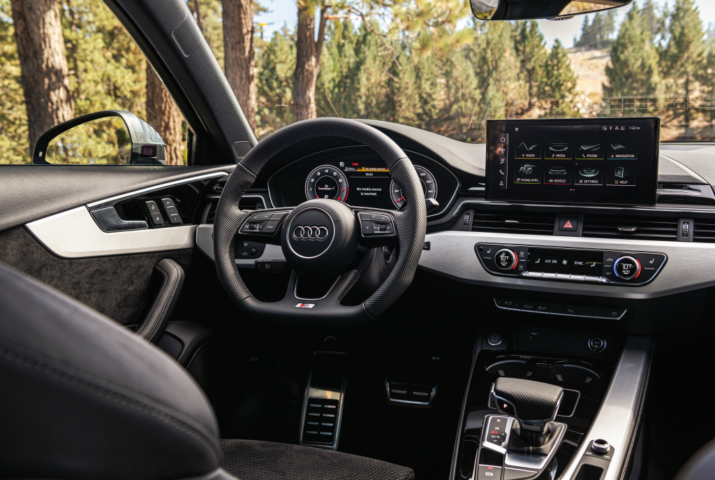
The classic buttons on the steering wheel instead of touch pads are certainly a more comfortable and, consequently, safer choice. It’s time to return them for the air conditioning or car stereo controls as well.
Looks like someone in VW’s interior design offices has recovered from a long binge. To then say: ladies and gentlemen, the end of touchscreens and displays, is really stupid. Let’s put the buttons back in place. Oh. Bingo. We in no way want to touch expensively trained and skilled designers and experts, but users of their products knew this from the start. What if they first ask those users how they use it and if they want it? Maybe someone would be surprised by their reaction. So come and take a look.
Touch screens are no longer expensive
At the outset, however, I’d like to make an observation that my partner inspired me to make. We don’t discuss cars very often, I understand the different hemispheres and the female view of the car as an absolutely useful thing on four wheels. Which also it usually ends. However, my significant other also managed to notice this from ads and similar channels, that more and more dashboards of current cars are made up of just two touch screens (or even just one). And commented that “it looks elegant and must be quite expensive”.
I would almost say that she is far from alone in this opinion. Today, in the era of touch screens in the pockets of each of us. I don’t know if the producers expected such an assessment, but the truth is exactly the opposite: it may seem luxurious in some places, but the touch screen is more impractical to operate while driving than the classic mechanical controls. And it’s cheaper too. With modern cars, an information center in the form of an LCD is needed, we understand that, but does everything, including the heating, really need to be controlled on the displays?
Buttons are best for frequently used functions
What if the elements that are operated frequently and regularly (typically audio system control and ventilation) were returned to the classic controls and buttons and were left in the menus and submenus of the touch screens just the ones set “once in a while” and not necessarily while driving? I’m sure most drivers would appreciate it. And if we stay with the concern and look, for example, at some older Audis (older in the sense of the penultimate generation), we find this combined solution to be the best.
And we don’t even have to go to Audi, the Golf VII is much more comfortable to use than the Golf VIII, the same goes for our Octavia III and IV. So why are newer cars worse (and more dangerous) to operate than new ones and are passed off as progress? The point of this action escapes me a bit. How pleasant it is to drive a car that is only a few years old, where the designer first thought of the driver and only then the budget. Or sit in the latest Land Cruiser, although I understand that it is a different price category than the Octavia. But if it worked then, it might work again, don’t you think?


