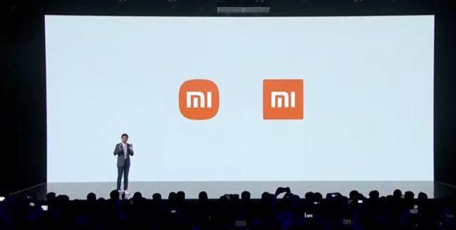
Xiaomi has not changed its logo for a long time, it was using this logo at many points. He announced that he decided to change the Xiaomi logo at the new product event held today. Company officials who took the stage at the event showed Xiaomi’s new logo for the first time.
HERE IS XIAOMI’S NEW LOGO
Xiaomi’s new logo looks quite similar to the old logo. In its new logo, Xiaomi seems to have made its new logo more noticeable by removing the corners and rounding the edges. The company worked with the world-renowned design master Kenya Hara for the new logo. The Xiaomi text that will accompany the logo is also a little different. For example, there are differences in the letter a. Xiaomi is already using its new logo, which is displayed in both written and unwritten forms, at its headquarters.
OLD AND NEW VERSION OF THE LOGO

Xiaomi’s old logo, which you will see on the right of the photo, had a square and therefore more angular design. With its new logo, Xiaomi has joined the companies that have recently changed its logo.
New year. New look. New us.
Together with @haraken_tokyo, we’ve changed our logo! How do you like our new logo? #XiaomiMegaLaunch pic.twitter.com/bqi33ZC3vE
— Xiaomi (@Xiaomi) March 30, 2021
 New hope for coronavirus: Spray vaccines could end epidemic–
 Apple has expanded its service!–
 He hasn’t gotten his hair cut in 15 years! The one who saw it was surprised–
–
– .


